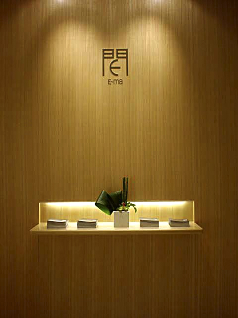
イーマ | e-ma
英語の発音i-ma=今 now E=(good),ma=空間、間、事をうまく運ぶ上での大切なころあい。
時間 空間、人間という間という文字の入るものをテーマにした大型商業施設。
2002年に大阪梅田にオープンした。
地下2階~地上6階までは物販、飲食、地上7~13階までは、
Tジョイと松竹によるシネマコンプレックスとで構成され、
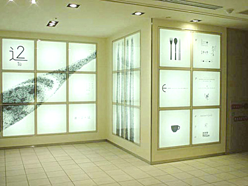
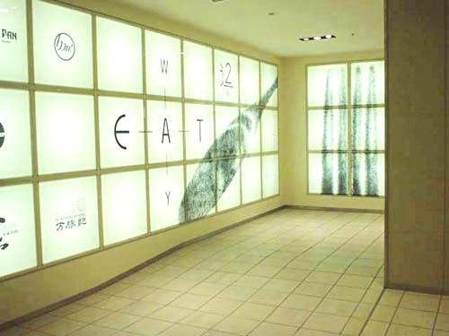
オープン後は地下街から地上への通路としても重要な日常動線となっている。
ここでは、1995年よりはじめた"新しい感字"という表現をビル名にし、
ネーミング、ロゴマークデザイン、美術、内装、広告など、オープンまでの
アートディレクトを担当する。
漢字とは、漢から伝わった文字です。
ここから、日本人は、平仮名をつくり、英語を読むためにカタカナを作るなど、
類をみない特殊な文字文化をもつ人種です。
現代、私たちの生活は、西洋文化を吸収し、
その文化を日本の風土にあわせた独自の"和"に作り替えようとしています。
ひらがなやカタカナを作ったように、今また言葉の進化の時期を迎えているかもしれません。
感字の誕生。英語の発音i-ma =今now E=(good),ma=空間、間、事を
うまく運ぶ上での大切なころあい。単語例)時間 空間、人間。
ネーミング/ロゴデザイン:
ニュウアーに続く"新しい感字"のシリーズを商業施設ビルの名前にしたもの。良い間、今、などの意味から人間、時間、空間というものを軸に大きな意味での日本の"間"を考え、門構えにアルファベットのEを入れ、イーマとし、現代日本の西洋文化と見直されはじめた東洋文化とをミックスした表現を試みた。門構えの中のアルファベットのEは、地下街から路面への通り抜ける路になるというコンセプトから矢印のイメージにデザインする。しかし、1点を指し示すものではなく180度人それぞれの方向があるものとし、先のまるい矢印にする。
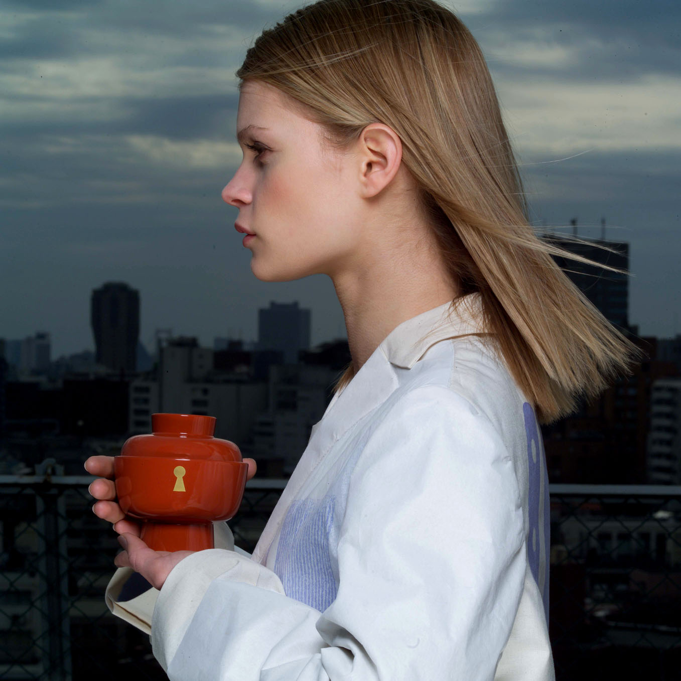
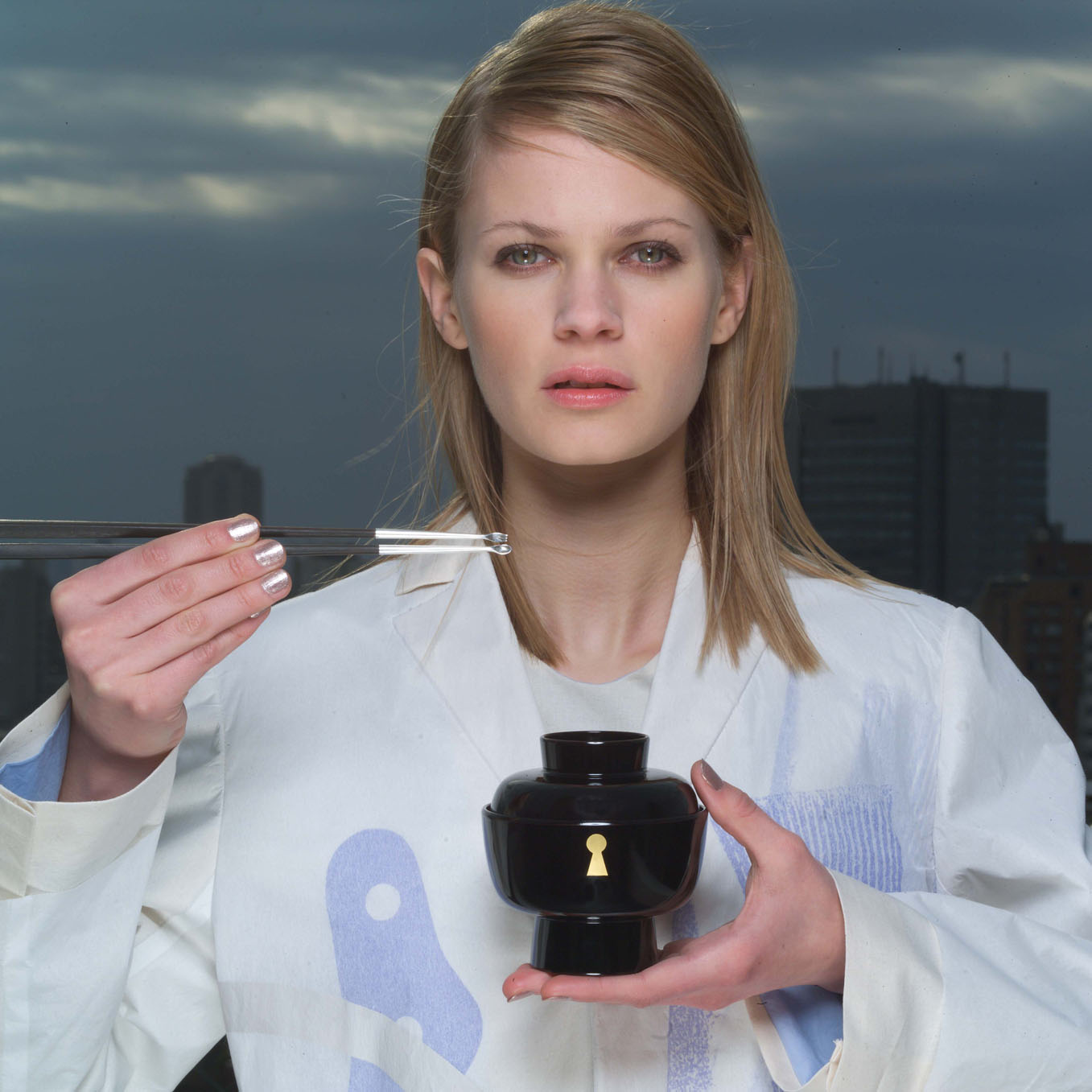
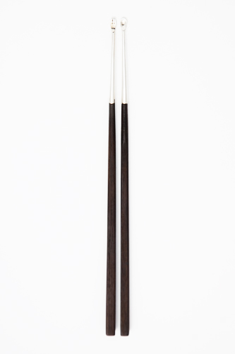
プロダクト:
イーマで、西洋文化とアジアの文化をミックスして出来た新しい"感字"。これに合わせて食文化の道具の違いも、同じコンセプトで一つにまとめてみました。素材は、西洋の代表としてシルバー、日本の代表として黒檀、この二つの組み合わせです。現在の日本の食卓の80%を占める西洋的食文化と、見直されはじめた和食。この私たちの生活に新しい道具がここに表現され、生れました。2膳揃えるとフォーク型同士、スプーン型同士、という使い方も可能です。
---
This large-scale commercial complex comprising retail and entertainment facilities opened in Umeda, Osaka in 2002. Two underground floors and six floors above ground contain retail shopping and restaurant spaces. Floors 7-13 contain a cinema complex managed by T-Joy and Shochiku. The building also serves as a major conduit between ground level and Osaka's extensive underground network of tunnels filled with transportation and retail facilities.
Hamiru acted as Art Director for the building from naming and logo design to art elements, interior, advertisements and through to the building's opening. With E~ma, she applied her "New Kanji" project to a large-scale commercial development. "Kanji", or the ideographic characters used in written Japanese were originally imported from China; Japanese words and Chinese characters then followed a parallel evolution to accommodate each other and form an indispensable part of Japan's written culture. Likewise, the angular, simplified "katakana" script was later used to write transliterations of imported words from Western countries. Japanese scripts have a history of evolving to fit the needs of the age. In the current age, Japan has absorbed Western influences into patterns of daily life, even going so far as to create a new concept of "Japanese-ness" and blurring the lines between East and West. The "New Kanji" project suggests that a new phase in the evolution of Japanese language may be in order to reflect Japan's changing identity.
Whereas the original characters for the word "Kanji" may be translated as "Chinese characters", HamiruÕs modified spelling comprises characters which translate as "feeling characters". As this change suggests, her new "Kanji" creations are exercises in free-style association which imbue original characters with multiple valences of meaning.
For example, a phonetic reading of the word "E~ma" is a homophone for a Japanese word which means "now". "E" is simultaneously a homophone for the Japanese word for "good", and "ma" means "space". The Japanese word "ma" also carries connotations of skillful timing and opportunity; it is also a component in the spellings of many words such as "time", "space" and "human". In this way, Hamiru's "New Kanji" naming plays on cross-cultural, cross-linguistic puns to expand the meaning of a mere three-letter word.
NAMING / LOGO:
The E~ma naming and logo applies the "New Kanji" series begun with "Newer" to a commercial development. The logo combines the roman alphabet "e" with a component of the ideogram for "ma", or space. The resulting phonetic and graphic elements create a complex of associative meanings that encompasses "good space", "now", "human", "time and space"... Pronounced "ee-mah", this newly created word embodies contemporary Japan's continued fascination with Western culture and a renewed interest in native Japanese culture. Further, the shape of the letter "e" as a stylized arrow signifies the building's role as a thoroughfare between Osaka's underground shopping arcades and ground level. As everyone who passes through the building follows different physical and figurative paths, however, the arrow is rounded to represent the freedom to choose your own direction.
PRODUCTS:
The E~ma concept and name fuse elements of Japanese and Western language and culture. This product extends the same principle to tableware. It combines the archetypical material for Western tableware, "silver", and fuses it with ebony, a traditional material for Japanese chopsticks. The contemporary Japanese diet consists of almost 80% Western foods, but there has been a recent surge in interest in native cuisine; this tableware reflects both influences.
---
AWARD:
2009 SDA Japan Sign Design Association イーマサイン計画
CREDIT:
Poster and concept book
広告制作:写真/宮原夢画 スタイリング/mint design
Advertorial (photography: Muga Miyahara, styling: mint design,)
---
http://www.e-ma-bldg.com/
2002年